Every year data analysts and design experts navigate through billions of bits of data to reveal what colours are going to be the most clickable colour scheme for marketers and advertisers.
This year’s Colour Trends Report shows a more muted, minimalist and soft approach compared to previous years. No flashy standouts, no neon highlights, nothing artificial — just simplicity and subtle elegance. Serenity is the key in 2022 when it comes to selecting colours. The data highlights that designers are gravitating toward calmer tints and away from intense tones.
Let’s have a look at the colours climbing the charts in the year to come:
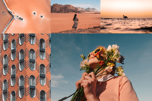
Calming Coral #E9967A
This muted, peachy pastel gets along splendidly with other members of the pastel family. It plays especially well with dusty yellows and pinks for a nostalgic tint to your design work. Consider contrasting it with sky blue to round out a comforting, natural palette.
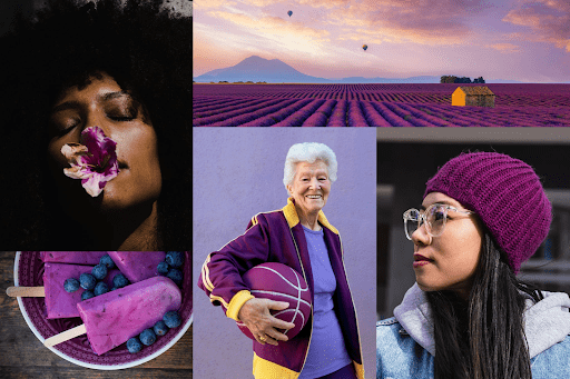
Velvet Violet #800080
Velvet Violet whispers and draws the eye with its come-hither magnetism. And yet, it represents the boldest of our trending colours for 2022, still able to turn heads without over-the-top flamboyance. The hue carries a decidedly regal tone, confident in its dignified grace and allure.
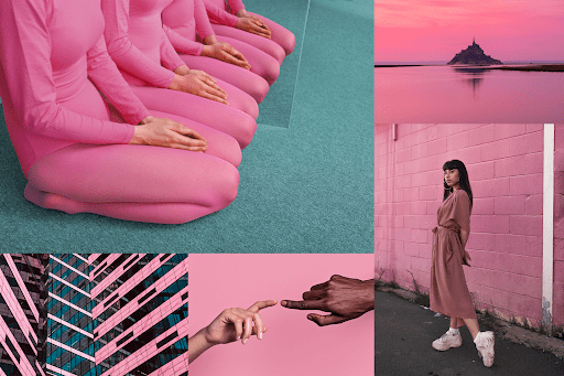
Pacific Pink #DB7093
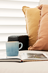
The trendiest colour in this year’s report brings to mind images of a fading flower pressed between pages of an old book. Tactile and rosy, like a still frame from your favourite Wes Anderson film. Whereas hot pink was cool for a hot minute (okay, millions of minutes), this subtle hue is about to have a banner year.
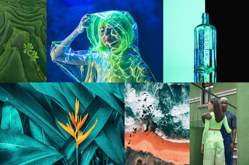
Green
This year’s data shows that shades of green dominated in click-through rates and conversions. So if you want your projects to perform like a pro, consider adding a touch of emerald, jade, lime, mint, and beyond.
